SpotOn
restaurant software optimization
my UX design project before
I knew what UX is
.png)
Project overview
Objective:
To optimize new restaurant POS system to better fit the restaurant's needs
Timeline:
January - March 2019
My role:
research
UX design
Background

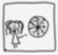
This is me. I used to be a floor manager at a very busy pizza restaurant.

One day the ownership introduced this new awesome POS system - SpotOn.

About a month later the reports showed that server mistakes, resulting in food and money weaste, have skyrocketed.
Problem
25%
increase in order mistakes
20%
longer time to ring in an order
Problem statement
How might we optimize SpotOn POS system to minimize server mistakes and descrease order input time?
Research
As a manager of the restaurant, I wanted to fix the problem. I started by talking to servers, who are the end users of the new system.
I asked everyone the same set of questions:
-
what do you like about the new POS system?
-
how do you think it can be improved?
-
what do you think could help you put in orders faster?
-
why do you think we see increase in server mistakes?
I also wanted to simply observe my employees while they are putting in orders, hoping to notice common patterns. (Yes, I was that awkward manager, creeping behind their backs).

Insights
1.
Touchscreen + long page scroll = accidental punches
2.
Insufficient visual hierarchy = difficult to spot a mistake
3.
All items on one page + many menu items = longer time to find necessary item
_edited.jpg)
_edited_edited.jpg)
Design concept
Since I was working directly with the developers, it was relatively easy to test ideas, I would sketch what we are thinking and it would get implemented.
Solution 1:
add a scroll bar - safe area to avoid accidental punches


Solution 2:
add visual hierarchy in order summary for easier eye-scan of what got put in


Solution 3:
break down menu into separate screens and add navigation to decrease time looking for items


Usability testing
As it was the easiest for the developers to implement, we started with solution 3 - breaking down items into separate screens and adding navigation. We tested it for about a month, and were happy with the results.
He have achieved a 30% faster flow to put in an order and 25% decrease in server mistakes.
This solution killed 2 birds with 1 stone:
-
breaking down items into categories helped find necessary items faster
-
less items on one screen helped avoid accidental punches.
.png)
The rest is history...
as I changed companies and couldn't continue working on SpotOn
Next steps
If I still had a possibility to work on SpotOn POS system, I would:
-
implement visual hierarchy into order summary area for easier scan of the inputted information
-
look into further business opportunities for SpotOn to design a restaurant "supersystem", including POS, online ordering, scheduling, financial reporting, etc.